The differences between responsive and adaptive design approaches spotlight important options for us as web and app designers. Choosing with insight can empower you to plan and execute your designs with better aim, purpose and results.
With the pervasiveness and diversity of mobile devices, as designers we need to cater to the variety of screen sizes. This is a challenge that every web and app designer currently faces. From the giant corporate monitor to the smartwatch, there are a huge number of ways that users can access information online today. Designers looking to bridge the gap between devices have two options for their designs: the adaptive site or the responsive site.

Author/Copyright holder: Stéphanie Walter. Copyright terms and licence: CC BY-SA 3.0
There is a certain amount of confusion as to the difference between responsive design and adaptive design. The boundaries may seem blurred to those without experience of either style of design, but there are clear differences when you look more closely at the two.
Responsive Design
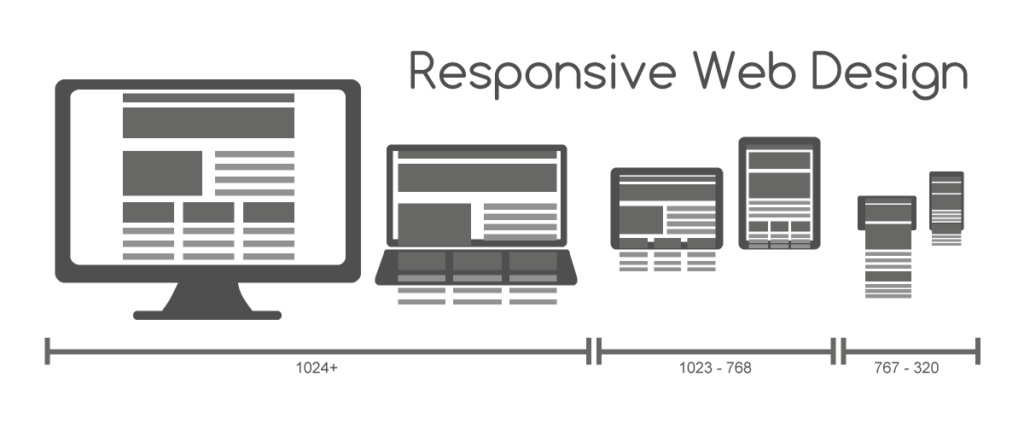
Author/Copyright holder: Muhammad Rafizeldi.. Copyright terms and licence: CC BY-SA 3.0
The term Responsive Design was first coined by the web designer and developer Ethan Marcotte in his book, Responsive Web Design. Responsive designs respond to changes in browser width by adjusting the placement of design elements to fit in the available space.
A responsive website shows content based on the available browser space. If you open a responsive site on the desktop and then change the size of the browser window, the content will move dynamically to arrange itself (at least in theory) optimally for the browser window. On mobile phones, this process is automatic; the site checks for the available space and then presents itself in the ideal arrangement.
Responsive design is straightforward. Because it is fluid, it means that users can access your online world and enjoy as much of it on their handheld device as they would on a massive monitor. For this to be true, responsive design requires a very good conceptualization of the site and a deep knowledge of the needs and wants of the end users!
Adaptive Web Design
Adaptive Web Design was introduced in 2011 by web designer Aaron Gustafson in his book, Adaptive Web Design: Crafting Rich Experiences With Progressive Enhancement. It is also known as progressive enhancement of a website.
Where responsive design relies on changing the design pattern to fit the real estate available to it, adaptive design has multiple fixed layout sizes. When the site detects the available space, it selects the layout most appropriate for the screen. So, when you open a browser on the desktop, the site chooses the best layout for that desktop screen; resizing the browser has no impact on the design.Accelerate your career: Get industry-trusted Course Certificates
BEGINNER UX COURSES
- Closes in 7 hrs 41 mins 50 secs—92% booked: UI Design Patterns for Successful Software
- Closes in 2 days—76% booked: Gestalt Psychology and Web Design: The Ultimate Guide
INTERMEDIATE UX COURSES
- Closes in 7 hrs 41 mins 51 secs—91% booked: UX Management: Strategy and Tactics
- Closes in 3 days—64% booked: Mobile User Experience (UX) Design
Some sites have been quick to embrace adaptive design. Amazon, USA Today, Apple, and About.com configured themselves to be mobile-optimized websites. Have a look at these. Notice that the layout displayed on a mobile website using adaptive design may be different from the desktop’s version. However, this is because the designers have picked a different layout for the phone’s screen rather than leaving the design to try to rearrange itself.
In adaptive design, it’s normal to develop six designs for the six most common screen widths; 320, 480, 760, 960, 1200, and 1600 pixels.
Standalone Mobile Design
There is also the option to create a mobile-only website (these are usually denoted in the URL bar of a browser using the “m.” prefix). This option was once an excellent approach. Designers would create sites for mobile devices, attuning the elements and layout for a dedicated format. Google delivered search engine rankings to mobile sites, but today the same preferences are given to adaptive and responsive sites.
The big drawback of creating a separate site (rather than using different designs or employing a changeable design) is that it requires an awful lot more maintenance in order to keep the two versions of a website homogenous. With no particular incentive to do this, the mobile-only design has fallen out of favor in recent times. It seems unlikely that it will make a comeback anytime soon.
Choosing Between Responsive and Adaptive Design
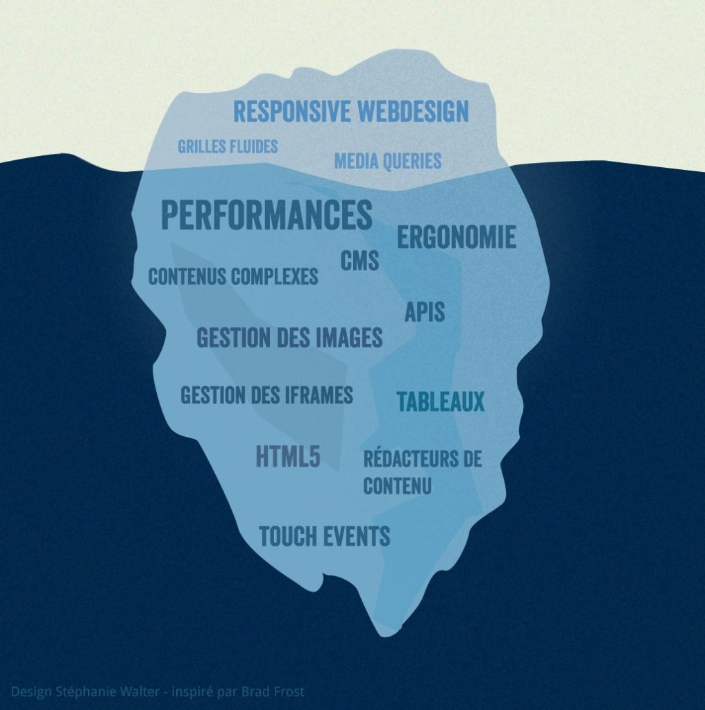
Author/Copyright holder: Stéphanie Walter. Copyright terms and licence: CC BY-SA 3.0
Responsive design is easier and takes less work to implement. It affords less control over your design on each screen size, but it’s by far the preferred method for creating new sites at this moment. This may also have something to do with the large number of cheap templates available for the majority of Content Management Systems (CMS) such as WordPress, Joomla, etc. — after all, who wants to reinvent the wheel?
Responsive designers create a single design to be used on all screens and will generally start in the middle of the resolution and use media queries to determine what adjustments will be made for the lower and higher end of the resolution scale. This tends to make users happy, because that familiar web design seems guaranteed to translate across to any device’s screen. Uniformity and seamlessness are crucial considerations in providing a good user experience.
It’s important to keep an eye on the visual hierarchy of responsive design projects; you want to try to maintain this as your elements shuffle around the screen. That means a lot of testing with many different devices to be certain that you’re delivering the goods. If the design for a site is relatively simple, it will translate well across device screens, flowing like a liquid from container to container.
SEO is another big argument for using a responsive design. Sites that use responsive design (i.e., ones with a URL that serve all devices) are currently more search engine friendly.
The responsive design seems to have a strong case for use. Well, it might; however, bear the following in mind:
- Because your website will “flow” from device to device, adjusting to the screen size, any advertisements that you’ve added may not fit into the space. Suddenly, the “shortcut” offered by using responsive design may need some rethinking and work.
- Download times vary between desktop and mobile devices. The flexibility of images is a big consideration here. A large design that comes through quickly on the big screen at home or in the office takes more time (and data) to appear on your mobile. Might a smaller preview be better for the mobile version?
Adaptive design will (theoretically) ensure the best user experience according to whichever device the user is using to interface. Unlike responsive design, where a screen “flows” from desktop design into a smaller device’s, adaptive design offers tailor-made solutions. As the name suggests, they adapt to the user’s situational needs and capabilities. As designers, we can show users that we’re in tune with their needs on a mobile device by making our design touch friendly. Meanwhile, we can do the same for desktop users. We begin at the lowest resolution version of the site and work our way up to the highest. Six designs are the current standard, but depending on your users’ data, you might be able to use fewer designs.Accelerate your career: Get industry-trusted Course Certificates

BEGINNER UX COURSES
- Closes in 7 hrs 41 mins 50 secs—92% booked: UI Design Patterns for Successful Software
- Closes in 2 days—76% booked: Gestalt Psychology and Web Design: The Ultimate Guide
INTERMEDIATE UX COURSES
- Closes in 7 hrs 41 mins 50 secs—91% booked: UX Management: Strategy and Tactics
- Closes in 3 days—64% booked: Mobile User Experience (UX) Design
A strength of adaptive design is that it feels more relevant to the modern user experience, whereas responsive design shows a more desktop-centric approach (with the demands of other devices taking a secondary, almost passive place). As users, we are out and about more with our smart devices. We like to feel that our devices are aware of what we’re going through. Let’s take a literal example; if you were driving through a long tunnel, wouldn’t you rather have a GPS screen that adapts to the environment and adjusts its brightness? That context-based performance and usability is reassuring, at the same time confirming that your smart device is smart enough to adapt and be extra useful.
You can also design to optimize advertisements for your relevant user interfaces with adaptive design. Because you’re designing for different resolutions (i.e., different fields of view), you can access your user’s specific needs. The sheer sophistication of sensors in, say, a smartphone allows companies (and us designers) to know more about our users than ever before. A user frequents a favorite store, restaurant, gym, etc. — by checking in there, he/she creates a profile. From this (behavioral targeting, otherwise known as personalization), we can design finely tuned advertisements.
Another advantage — research shows that a company with an adaptive website will often outperform, on speed tests, a company with a responsive website. This isn’t a small difference either; adaptive sites are often 2-3 times faster than responsive ones and give rather less data to the user in order to deliver the user experience.
Adaptive design has some strong advantages. However, in the game of designing for the best user experience and providing the best solutions, we must remember that we have to take the time to examine our options and the realities of our users.
There are drawbacks to adaptive design. Firstly, it’s usually a lot more work than creating a responsive design. For that reason, the majority of adaptive designs are used to retrofit existing sites to allow them to be used on multiple devices. It appears, then, that the first order of business is to bring traditional sites up to date by allowing them to reach across more devices.
Secondly, adaptive designs can leave out users “in the middle”. Tablet or netbook users might be left “hanging” because designers have only catered to desktop and smartphone users. Therefore, it’s important to offer a link to let the user toggle between versions.
Lastly, while search engine bots are getting better about sifting and sorting through hits to distinguish between your “.com” sites and “m .com” sites, it’s wise to accept the status quo. Most search engines still don’t rank identical content over multiple URLs equally. That means being mindful that an adaptive design might keep you back on SEO.
So, while there’s a definite preference for responsive design at the moment, don’t dismiss adaptive design if you have the budget. Google likes websites that load fast, as do users.
The Take Away
Author/Copyright holder: Brisbane Web Design. Copyright terms and licence: Public Domain
Modern web design gives us three options to use: Responsive, Adaptive, and Standalone Design, although standalone has fallen into disuse.
Responsive Design lets designers show content based on the browser space available. This allows consistency between what a site shows on a desktop and what it shows on a handheld device. Responsive design is the “traditional” option and remains the more popular approach to date.
| Pros | Cons |
| Uniform & seamless = good UX.Abundance of templates to use.SEO friendly.Often easier to implement | Less screen size design control.Elements can move aroundAdvertisements lost on screen.Longer mobile download times. |
Adaptive Design, developed in 2011, is more involved in that the designer has several fixed layout sizes. It offers an alternative to the “one-size-stretches-to-all” approach.
| Pros | Cons |
| Allows designers to build the best UX for the appropriate device.Mobile devices can sense their user’s environment.Designers can optimize advertisements based on user data from smart devices. | Labor-intensive to create – most adaptive designs are retrofitting traditional sites to make them more accessible.Tablets and netbooks can have trouble with site configuration tending to be smartphone- or desktop-oriented.Challenging to SEO — Search engines have trouble appreciating identical content on multiple sites. |
Choosing between a responsive and an adaptive design takes careful consideration. While it might be prudent to stick to a responsive design for the sake of expedience (saving cost, improving SEO, and keeping users content with a seamless experience between devices), it’s crucial to check the pros and cons of both designs in full. Adaptive design can tune in more to users’ varying needs in the field; thus, it’s vital to keep a finger on the pulse of change.
We might best picture these changes as evolution. Charles Darwin noted that the individuals in a species that survive aren’t the strongest or smartest, but those most adaptable to change. We have only the dinosaurs to consider in light of that.
Think about your product or service. Does it access users in a specific setting? What is it about their behavior that you can use to keep them informed and engaged? Remember, it’s not just mobile devices that are getting smarter. In our homes and offices, we have more than traditional desktops. Now, a wide range of smart devices sense and react to the environment, from clocks and heaters to a host of devices that comprise the “Internet of Things”. It’s an age that’s full of smarter objects. We must design with that smartness increasingly in mind.

